Office color schemes play a crucial role in creating a productive and inspiring work environment with the potential to boost employee morale, creativity, and focus.
The Importance Of Vibrant Designs
When it comes to creating an office space that is not only visually appealing but also conducive to higher productivity levels, the color scheme plays a crucial role. Incorporating vibrant designs into your office can have a significant impact on the atmosphere, mood, and overall well-being of your employees. In this article, we will explore how color impacts mood and productivity in the office and delve into the psychological effects of different colors on the human brain. By understanding the significance of vibrant colors, you can create a positive and inspiring work environment that enhances creativity and fosters success.
How Color Impacts Mood And Productivity In The Office
Vibrant colors have the power to evoke various emotions and significantly influence our mood and productivity levels. Bright and bold hues can stimulate and energize individuals, making them more alert, motivated, and focused on their tasks. On the other hand, muted and neutral colors may create a calming effect, promoting relaxation and reducing stress levels. By carefully selecting color schemes tailored to different work areas, you can optimize employee performance and enhance overall productivity.
The Psychological Effects Of Different Colors On The Human Brain
Each color possesses its own psychological significance and can influence the human brain in diverse ways. Understanding these effects is crucial when determining the right color scheme for your office. Here are some examples:
| Color | Psychological Effect |
|---|---|
| Red | Increases energy and stimulates enthusiasm. Ideal for areas where physical activity or high attention to detail is required. |
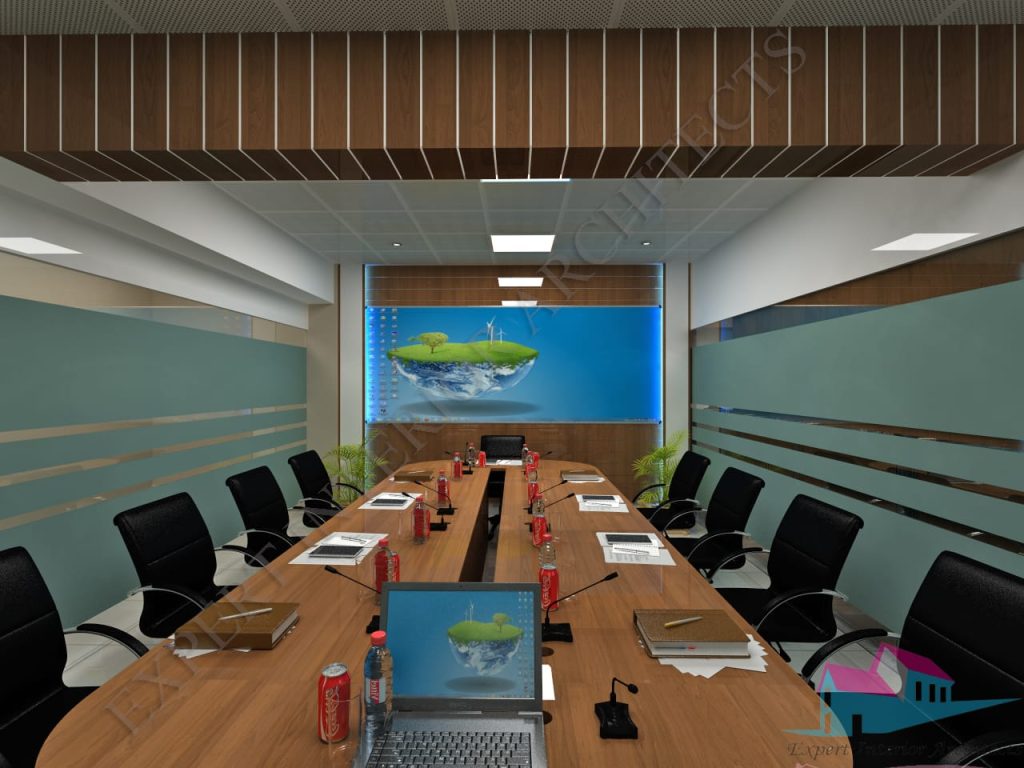
| Blue | Creates a sense of calmness and tranquility. Suitable for spaces where focus and concentration are necessary, such as conference rooms. |
| Yellow | Elevates mood, enhances creativity, and fosters optimism. Perfect for areas where brainstorming and innovation take place. |
| Green | Symbolizes growth, harmony, and balance. It promotes a sense of well-being and is ideal for offices that aim to create a nurturing and collaborative environment. |
Creating A Positive And Inspiring Work Environment With Vibrant Colors
To create a positive and inspiring work environment, it is essential to incorporate vibrant colors strategically throughout the office space. Here are a few tips to help you achieve this:
- Use bold and vibrant colors in common areas, such as break rooms or lounges, to stimulate creativity and encourage social interaction.
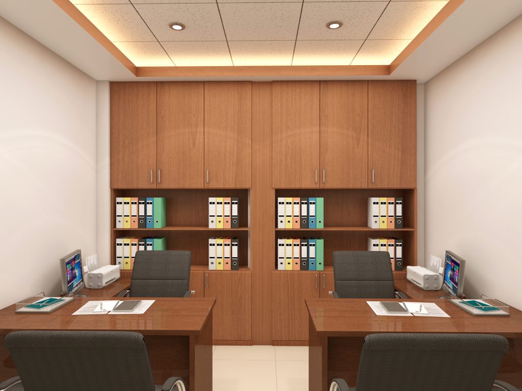
- Opt for softer, calming tones in areas where employees need to focus, such as workstations or individual cubicles.
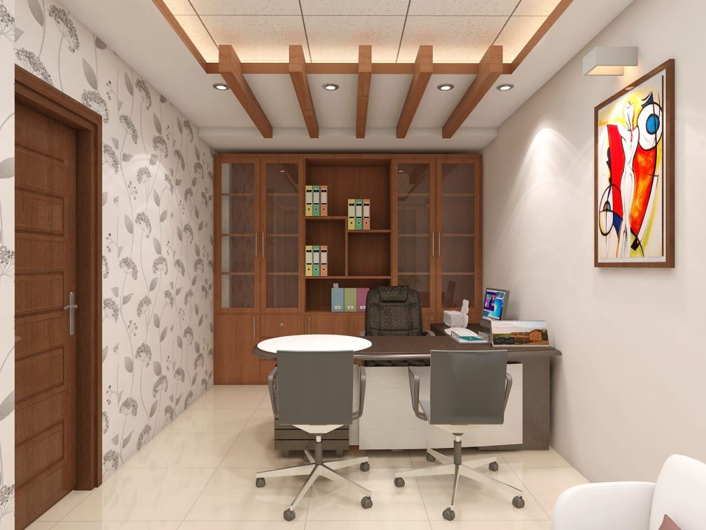
- Consider incorporating pops of vibrant colors in accent walls, furniture, or artwork to add visual interest without overwhelming the space.
- Experiment with different color combinations to find the balance that aligns with your company’s brand and culture.
By carefully selecting and implementing vibrant color schemes in your office, you can create an environment that inspires your employees, enhances their well-being, and ultimately boosts productivity. Remember, the key is to strike the right balance and consider the specific needs of your team members. Take advantage of the psychological effects of colors and let your office design become a catalyst for success.
Choosing The Right Color Palette
Choosing the perfect color palette for office color schemes boosts productivity, enhances mood, and creates a professional environment. Whether opting for calming neutrals or vibrant pops of color, selecting the right hues can make a significant impact on the overall atmosphere of the workspace.
One of the most important decisions when designing an office space is choosing the right color palette. The colors you select will have a significant impact on the overall ambiance and productivity of the workplace. In this blog post, we will explore the psychology behind colors and how they affect us in the workplace. We will also discuss different color schemes and their meanings, and how to match them to your company’s brand and culture. Let’s dive in!
Understanding The Psychology Of Colors In The Workplace
When it comes to choosing the right color palette for your office, understanding the psychology behind colors is crucial. Colors have the power to evoke specific emotions and influence our mood and behavior. Here are some common colors used in office spaces and their psychological impact:
Blue:
Blue is known for its calming and soothing effect. It promotes a sense of tranquility and can help reduce stress and anxiety. It is a great choice for high-stress work environments or areas where concentration is key. Blue is also associated with trust and reliability, making it an ideal color for businesses in finance or technology.
Yellow:
Yellow is a vibrant and energetic color that promotes creativity and positivity. It is known to stimulate the mind and encourage clear thinking. Yellow is often used in creative industries or areas where innovation is encouraged. However, it’s important to use yellow in moderation as excessive yellow can be overwhelming and lead to eye strain.
Green:
Green symbolizes nature and growth, creating a sense of harmony and balance in the workplace. It is often associated with productivity and is believed to increase focus and concentration. Green is perfect for office spaces where collaboration and team-building are emphasized.
Exploring Different Color Schemes And Their Meanings
Monochromatic:
A monochromatic color scheme involves using different shades, tones, and tints of a single color. This creates a cohesive and harmonious look. Monochromatic color schemes are elegant and sophisticated, offering a sense of simplicity and unity. It is a safe choice for conservative industries or businesses that want to convey a sense of professionalism.
Analogous:
An analogous color scheme involves using colors that are adjacent to each other on the color wheel. This creates a harmonious and visually pleasing effect. Analogous color schemes are great for creating a sense of warmth and comfort. They work well in office spaces where a relaxed and friendly atmosphere is desired.
Complementary:
A complementary color scheme involves using colors that are opposite each other on the color wheel. This creates a high contrast and vibrant look. Complementary color schemes are bold and eye-catching, making them suitable for businesses that want to make a statement. However, it’s important to use complementary colors in moderation to avoid overwhelming the workspace.
Matching Colors To The Company’s Brand And Culture
When choosing a color palette for your office, it’s essential to consider your company’s brand and culture. The colors you select should align with your brand identity and convey the right message to employees, clients, and visitors. Take a look at your company’s logo and branding materials. Consider the emotions and values associated with your brand. If your brand is modern and innovative, you might opt for a color palette with bold and vibrant colors. On the other hand, if your brand is traditional and trustworthy, a more subdued and professional color scheme might be suitable. Additionally, think about your company’s culture and the atmosphere you want to create in the workplace. If you foster a culture of creativity and collaboration, a color scheme that promotes these values, such as a combination of green and yellow, may be a good fit. However, if your office space requires a sense of calm and focus, a blue or monochromatic color scheme might be more appropriate. Remember, choosing the right color palette involves careful consideration of the psychological impact of colors, the meanings behind different color schemes, and how they align with your company’s brand and culture. By selecting the right colors, you can create a workspace that not only looks visually appealing but also enhances productivity and well-being.
Implementing Vibrant Color Schemes
Creating an inspiring and vibrant office color scheme can have a profound impact on the productivity and creativity of employees. Bold and vibrant colors can stimulate the senses, ignite inspiration, and energize the work environment. In this section, we will explore the key elements of implementing vibrant color schemes, including selecting bold and vibrant colors, incorporating different shades and tones, and using accent colors to add visual interest and energy.
Tips For Selecting Bold And Vibrant Colors That Inspire Creativity
When choosing bold and vibrant colors for your office, it’s essential to consider the psychology behind each color. Different colors evoke different emotions and can have a significant influence on mood and productivity. Here are some tips for selecting bold and vibrant colors that inspire creativity:
- Consider the purpose of the space: Think about the specific function of the room or area you are designing. If it’s a brainstorming room, you might want to opt for a bright and energetic color like red or orange to stimulate creativity. If it’s a quiet workspace, soothing colors like blue or green can promote concentration and focus.
- Use color combinations: Experiment with combinations of bold colors to create visual impact. Complementary colors, such as blue and orange or purple and yellow, can create a vibrant and dynamic atmosphere. Analogous colors, where hues are adjacent on the color wheel, can provide a harmonious and balanced feel.
- Consider your brand: Incorporate your company’s brand colors into the office design. This not only creates a cohesive visual identity but also reinforces brand recognition and fosters a sense of belonging for employees.
Incorporating Different Shades And Tones To Create Balance
While using bold and vibrant colors is essential to create an energetic office environment, it’s equally important to incorporate different shades and tones to maintain balance and prevent overwhelming visual stimulation. Here’s how you can incorporate different shades and tones:
- Use lighter shades: Lighter shades of bold colors can tone down the intensity while still adding vibrancy. For example, if you choose a bold red as the main color, you can use a lighter shade of pink or coral as accents or on the walls.
- Create contrast: Pairing bold colors with neutral tones such as white, gray, or black can create a striking contrast that balances the vibrancy. This allows the bold colors to stand out while maintaining a visually pleasing environment.
- Consider textures: Introduce different textures through furniture, accessories, or wall finishes to add depth and interest to the space. Textures can soften the impact of bold colors and create a more visually appealing atmosphere.
Using Accent Colors To Add Visual Interest And Energy
Accent colors play a crucial role in enhancing the vibrancy of an office color scheme. They add visual interest, energy, and can help highlight key elements in the space. Here are some ways to effectively use accent colors:
| Placement | Examples |
|---|---|
| Accent walls: | Painting one wall in a bold accent color can create a focal point and draw attention to certain areas of the office. |
| Furniture and accessories: | Incorporate accent colors through furniture pieces, artwork, rugs, or decorative accessories. These elements can add pops of color and create a cohesive design scheme. |
| Signage and branding: | Use accent colors for important signage or branding elements to increase visibility and attract attention. |
By strategically incorporating accent colors, you can infuse energy into the office space and create a visually stimulating environment that promotes creativity and productivity.
Popular Office Color Schemes
Choosing the right color scheme for your office can make a significant impact on the overall ambiance and productivity of your workspace. Colors have the power to influence emotions, creativity, and even focus. With that in mind, it’s important to select a color palette that aligns with your company’s branding and reflects the desired mood and atmosphere. In this article, we’ll explore some of the popular office color schemes that can transform your workspace into a modern and stylish environment.
The Trending Color Palettes For Modern And Stylish Office Designs
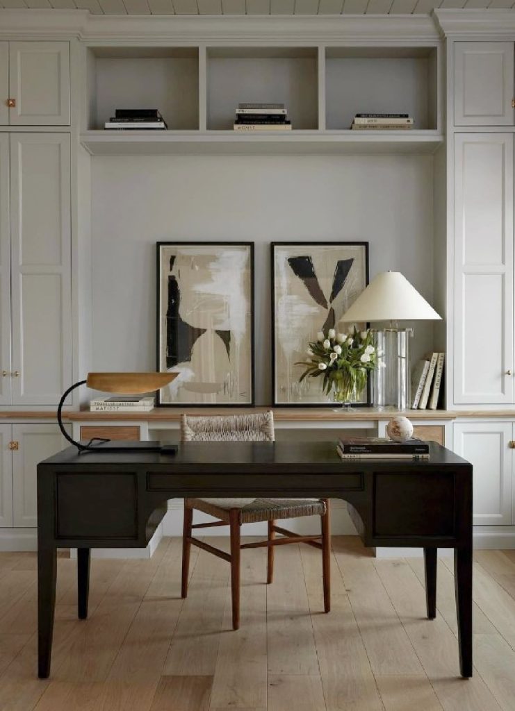
Modern office designs often focus on simplicity, minimalism, and clean lines. The color schemes that align with this aesthetic typically include neutral tones such as whites, greys, and beiges. These colors create a clean and timeless look, providing a blank canvas for other design elements to shine. Combining these neutral shades with pops of vibrant colors, like a bold red or a lively green, can add a fresh and modern touch to your office space. Additionally, mixing different shades of the same color family, such as various shades of blue or different hues of purple, can create a harmonious and cohesive look, bringing a sense of sophistication to the design.
Creating A Vibrant And Energetic Atmosphere With Bold Color Combinations
If you’re looking to infuse energy and vibrancy into your office space, consider using bold color combinations. Bold colors like yellow, orange, and red can add a sense of excitement and creativity to your workplace. These colors are known to stimulate the mind and promote productivity. Pairing these striking hues with complementary or contrasting colors, such as a vibrant blue or a deep purple, can create an eye-catching display. Additionally, incorporating geometric patterns or artwork with bold colors can further enhance the energetic atmosphere, making your office a place where ideas flourish and innovation thrives.
Incorporating Natural Elements And Textures For A Harmonious Look
Nature-inspired color palettes have gained popularity in recent years, as they create a soothing and calming atmosphere in the office. Incorporating shades of greens, blues, and earthy tones can evoke a sense of tranquility and balance. Pairing these natural hues with organic textures, such as wooden furniture or natural stone accents, can further enhance the harmonious look. Plants and greenery can also be added as decorative elements to bring the outdoors inside and create a refreshing and lively atmosphere. By incorporating natural elements and textures, your office space will not only look beautiful but also contribute to the well-being and productivity of your employees.
Tips For A Successful Color Transformation
When it comes to revamping your office space, implementing a new color scheme can bring a fresh and vibrant energy to the environment. However, a successful color transformation requires careful planning and consideration. In this article, we will explore some essential tips to ensure your office color transformation is a seamless and successful process.
Before diving headfirst into choosing colors, it’s important to assess the current state of your office space and prepare it for the upcoming transformation. Here are some practical steps to consider:
- Clear the space: Start by decluttering the area and removing any unnecessary items or furniture. This will provide a clean canvas for the new colors to shine.
- Consider lighting: Take note of the natural and artificial lighting within the space. Different colors can be affected by lighting, so keep this in mind when selecting your color scheme.
- Identify the purpose of each area: Understand the functionality of different areas within your office. Are there specific zones that require a calm and serene atmosphere? Or areas that benefit from vibrant and energetic colors? Identifying the purpose of each area will help you choose the appropriate color scheme.
Implementing vibrant designs in your office can significantly enhance creativity and productivity. However, it’s crucial to keep some practical considerations in mind to ensure a successful outcome:
- Choose appropriate colors: Vibrant colors can be stimulating, but make sure to select shades that align with your brand and work culture. Bold color choices can influence emotions and affect employee morale.
- Balance with neutral tones: While vibrant designs can be exciting, it’s essential to balance them out with neutral tones. This prevents the office from becoming overwhelming and creates a harmonious blend.
- Consider the size of the space: Bold and vibrant colors tend to dominate a room and make it appear smaller. If your office space is limited, incorporating these colors in small doses or as accent walls can create a dynamic effect without overpowering the area.
Creating a collaborative workspace involves engaging your employees in the color selection process. Here’s how you can do it:
- Distribute color swatches: Share color swatches with your team members to gather their input. This allows them to visualize how different colors might work within the workspace.
- Host a color workshop: Organize a workshop where employees can discuss the impact of colors on mood and productivity. Encourage open dialogue and incorporate their preferences into the final color choices.
- Encourage personalization: An engaging workspace often allows employees to personalize their immediate surroundings. Consider providing options for personal touches, such as decorative items or customizable workspace elements.
By involving your employees in the color selection process, you foster a sense of ownership and create a collaborative environment where everyone feels heard.
:max_bytes(150000):strip_icc()/modern-home-office-ideas-4802025-hero-7cf9b3abe1374494a0159692ef978f9b.jpg)
Credit: www.thespruce.com
Frequently Asked Questions On Office Color Schemes
What Are The Best Office Color Schemes?
Choosing the best office color schemes largely depends on the nature and purpose of your work environment. Opt for calming neutrals like blues and greens for a serene atmosphere or go for energizing shades like yellows and oranges to boost creativity and productivity.
Experiment with different shades to find the perfect balance for your office space.
Can Office Color Schemes Affect Productivity?
Yes, office color schemes can greatly impact productivity. Colors like blue and green have a calming effect and can enhance focus and concentration. On the other hand, vibrant colors like orange and yellow can stimulate creativity and energy levels. Choosing the right color scheme can improve the overall mood and work efficiency of employees.
How Do Office Color Schemes Influence Employee Morale?
Office color schemes have a significant impact on employee morale. Bright and cheerful colors can create a positive and uplifting environment, promoting enthusiasm and motivation. On the contrary, dull and gloomy colors can dampen spirits and lead to a lack of motivation.
Choosing colors wisely can boost employee morale and create a pleasant work atmosphere.
Do Office Color Schemes Affect Customer Perception?
Yes, office color schemes can influence customer perception. The right colors can evoke emotions and create a welcoming and professional ambiance. Warm and inviting colors like earth tones can make customers feel comfortable, while bold and vibrant colors can leave a lasting impression.
Consider your target audience and the desired brand image when choosing colors for your office space.
Conclusion
Choosing the right office color scheme can have a significant impact on productivity, morale, and overall atmosphere of the workplace. A well-thought-out color palette can create a calming environment, stimulate creativity, and encourage collaboration among employees. By understanding the psychology of color and considering factors like brand identity and personal preferences, you can create a visually appealing and harmonious workspace that enhances the overall work experience and contributes to the success of your business.
So, don’t underestimate the power of colors in the office and make a statement with your color choices.


